Typography Project
The brief started very simple. Tear/cut out some letters from black paper, keeping them roughly within 75mm high.
Part 2 Trace letters with pen tool in illustrator. Ok I can deal with that. Things I like that I incorporated - the fact that I cut it out poorly. I traced the jagged little paper cut frays around all the knife turns, makes the vectors look more like the real paper lads. I was pretty happy with that. That being said, after I traced a few to be marked, I did cheaty cheat. Of course I just used trace. Shhhh. But the sentiment and the design argument was there!
Part 3 Make 4 promotional postcards and a poster for your font on illustrator. I knew I didn't just want to place some letters on a page like those type of graphic designey digital type posters where one big letter is half off the page, and some transparencies of other letters float around asking art questions. That would look really wrong and modernised with my paper cut irregular human letters. When I was asked to name my font in the first project I called it 'Bubble Hand Bob'. Not for any reason other than because bubbles were the main thing you notice. So from that I decide to cheat and make the project narrative so I can adapt it to myself better! Bubble Hand Bob became a character whos exploits could be recreated in the postcard series. We are only allowed to use the letters, but I just decided to turn my letters into pictures ( I like pictures better and stuff.) I think thats allowed. I'll find out next semester I guess!
It became the story of a man called Bob who lived in a boring town and wanted to be an adventurer. Here's 2 of the postcards and the long format poster. The poster suffers from blurring, I think because I used way too much copy and pasting and scaling and rescaling, I'm not sure yet, I'll have to look in to it. All the colour on the clothes etc is made from tiny letter o's, and all other parts of illustrations are letters themselves, scaled or chopped.
Postcards
Poster
Part 4 Make a storyboard of your proposed 3 screen minimum website to promote the font. Well I figured screen one would be something roughly like this, using the poster image. This displays an idea of the whole alphabet, and also introduces the character.
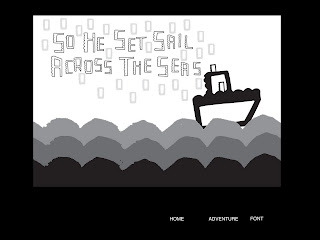
and screens 2 and 3 would the same design like so (with border), but screen 2 would essentially be a story. It would open to an animation depicting Bubble Hand Bobs adventure, as a development from the stills in the postcards. Screen 3 would be a simple animated display for the font.
Here's the stills
I made the videos as simple flash animation on illustrator, there's only around 30 frames max. In the one I'm uploading. The project is more of a proposal than a finished work, so only one postcard was brought to that point, the rest were implied in notebook work.
Because the future we live in is confusing I wasn't able to upload the flash file on blogger, so I haphazardly converted it to something viewable I hope, after much hair pulling!
Here's a slightly jumpy idea of how it would look.


No comments:
Post a Comment